These are things that I did in class on Thursday. The really crazy one is one I made from flipping a coin to see what parts of the text I would make, italic, regular, normal, side ways, big, small or even what position to put it on the page. The fate of the design was all left up to the coin. This made me frustrated, because all the big type kept falling on page page and spot. I think this was a good exercise though to help me break out of the box and really experiment instead of making the designs so static and formal.
Thursday, January 29, 2015
Wednesday, January 28, 2015
type 2: 1.29
During class on Tuesday I basically used my time to research and explore more typography, sketch and experiment more. I still was basically on the front cover, but for Thursday I should have a better idea of the complete package than I did before. This is part one of this blog post; the rest and best is yet to come.
Tuesday, January 27, 2015
Type 2: 1.27
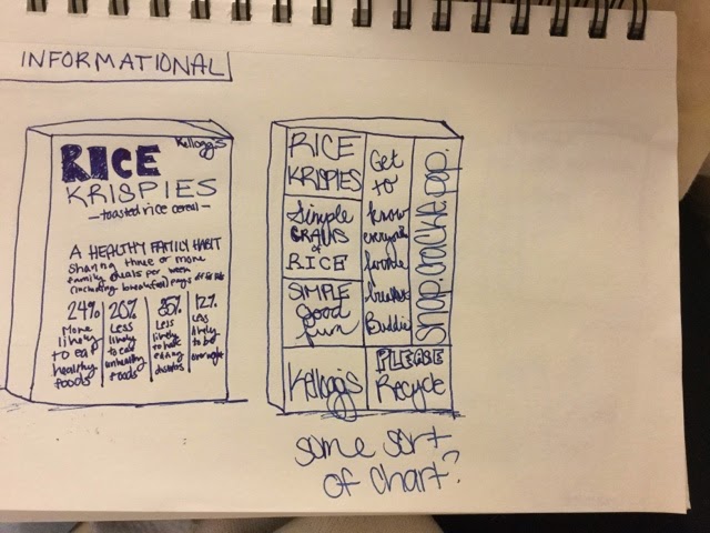
In the pictures below you can see my experimentation for the front of the cereal boxes. In each sketch I labeled what connotation those would have. This process was harder for me than I thought it would be, because I kept wanting to add pictures or things to fancy up the front of the package. Another difficulty for me was thinking of ways to demonstrate the specific connotation associated with each box, some of the categories were easier than others. I'm hoping more ideas come up in class today when I talk to Kidwell as well as the other students.
Wednesday, January 21, 2015
Type 2: 1.20
Tuesday I came back to school for the first day of the spring semester; my first class was Type 2. Diving into school again was easier this semester than others, because I was already getting up early, going to lecturers and learning all throughout January during my design study abroad trip. I studied for two weeks total - one in Havana, Cuba, the other in Miami. The goal of the trip was to compare and contrast between the two cities in terms of design. I saw a lot of typography, political propaganda, billboards and other things involving design. I am hoping that this semester and in the future this trip can help mold the way that I create my own work. I think that the David Carson TED talk speaks to this, because he says, "You have to utilize who you are in your work. Nobody else can do that:
nobody else can pull from your background, from your parents, your
upbringing, your whole life experience." The study abroad experience has given me a unique perspective and will help create my own personal style in design. No, the trip won't make me change my design style completely, but it's another addition to my background of experiences that will create who I am personally and who I am as a designer. Hopefully this will help me to create original work that is unlike anyone else's. The TED talk showed me that we should break the boundaries of standard type on a page, and get out of the box. The outside of the box is literally what we are designing for the first project so I guess it all comes full circle.
Subscribe to:
Comments (Atom)


.jpg)


