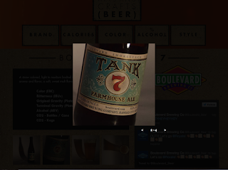
Once I finally decided on my look of my direction, which I wanted to be more rough and organic like the title of "craft" beer, I took a lot of time actually finding out the technical challenges of the project. I think that if I did this project again that I could work way faster and spend more time on the actual design, because a lot of the project was just teaching yourself how to use Adobe Muse. I overall enjoyed this project and thought it was a nice change to the typical design we usually do. I think I learned about about not making the viewer think too much, and figuring out how the brain compared to how you think it works when viewing websites. Here is a click through of a couple pages from the final versions.


No comments:
Post a Comment