Monday, September 21, 2015

Final website

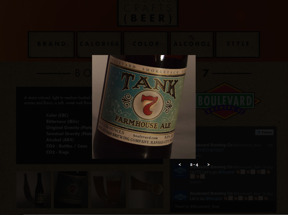
Once I finally decided on my look of my direction, which I wanted to be more rough and organic like the title of "craft" beer, I took a lot of time actually finding out the technical challenges of the project. I think that if I did this project again that I could work way faster and spend more time on the actual design, because a lot of the project was just teaching yourself how to use Adobe Muse. I overall enjoyed this project and thought it was a nice change to the typical design we usually do. I think I learned about about not making the viewer think too much, and figuring out how the brain compared to how you think it works when viewing websites. Here is a click through of a couple pages from the final versions.


Narrowing down

As I got further and further into process, I had two directions that I really wanted to go with this first option is more of a vector based, girly theme I thought. I reached a certain point and I decided for my audience I needed to go in a different direction – something that spoke to both the girl and both beer lovers of the world. These images are the first option.


Process

To go with the site map and wire frames in the last post I wanted to show quick sketches of other wire frames and site maps I made as well as quick notes from our class book. I think it's important to show process to see everything laid out. It shows how something was crafted into what the finished product is.


Tuesday, September 1, 2015

SITE MAPS AND WIRE FRAMES

In this blog I am posting my new refined site maps and wire frames. Site Maps show how each page connects to one another. Wire frames need the sitemap to help execute how it looks visually.