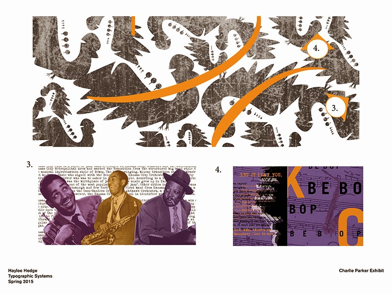
My two experiences of the exhibit and the print piece are meant to be seen in a way which music is seen, poetically not as realistic. Many of the images have different colors than the original black and white or have quotes or phrases that describe his life at the time. The first part of the exhibit shows early life and Kansas City and then through out it walks through his Be Bop phase in New York all the way until his death. At the end it's the total combination of all his experiences influencing his music in a way that is original to him. The no dancing sign is to indicate how Be Bop changed jazz from a dancing music to just sitting and listening music. I chose the words "chromatic" and "addiction" for the outside, because be bop was a huge part of his life and chromatic describes the way this music was unique. I used the word "addiction" to reflect how drugs had a big impact on his life, but even more so he was
addicted to creating music. I used the same blue from the Charlie Parker head statue on the outside doors to make the connection that this ties into Charlie Parker without having it say it but still have the orange on the sides to tie the inside and outside together. I also wanted to honor the time, but not make the pieces feel like they came out of the 1930s, so I included old pictures and a typewriter typeface but kept the colors mellow. I would attribute this to calming, which also ties back to the Be Bop as a listening music and not a dancing music.


_Page_1.jpg)
_Page_2.jpg)
_Page_3.jpg)
_Page_4.jpg)
_Page_5.jpg)
_Page_6.jpg)
_Page_7.jpg)
_Page_9.jpg)


