For this week's blog post we were directed to the blog "Thinking Form." It's a blog focused on inspirational forms of typography, books, art, architecture, design, grid systems, illustration and photography. They are an independent studio in Brooklyn. One of the men I read about on the site studied in Switzerland. His name is Pierre Neumann. His work caught my eye, because his poster designs are diverse and create a large combination of very simple, black and white to many colors and more complicated. He seems to never run out of ideas or concepts for new and exciting things. His works have been in various museums and galleries.
Sunday, March 29, 2015
Continuing with one concept
I decided to go with the direction of the Civil War and created three more chapter openings to see if my vision was what I thought it could be. These are the results of experimenting more with that.
Type Experimentation
The first part of the experimentation was finding ways to show paragraphs without always indenting. It varied from indent, extent, bolding the first word, letter, phrase or sentence. The list goes on. It's amazing what you can do to a paragraph and people will still recognize what you are trying to tell them or how to read it. The second part was finding 12 serifs and 12 sans serifs to figure out which I liked and how they compare to each other based on x-height and paragraph style.
Initial Type workbook concepts
The first concepts I had were to make the book based on awesome pictures from the Civil War with funny or relevant quotes to go with it. The second was inspired by movement and dance. This would be the more serious one. The third concept would be light-hearted and filled with funny pictures of kids. The last I wanted to do it inspired by my study abroad trip to Cuba.
Design Theory Update: Hurricane Katrina
I think I got a lot out of this interview, because he helped me to see what I couldn't. I had been looking at these things so much that I couldn't tell what I liked and what I didn't like about them. The bottom line from my interviews with my room mates was that I needed to fully explain things on my annotation, instead of expecting people to know what FEMA meant or why it's one thing on the original poster, but that's actually not what it stands for. They also helped me realize that I should tie together all three more completely by color context and overall feel. I decided to go forward with the ones that all looked like Louisiana. They suggested I make the map bigger to make it actually seem like a real map and not just a brochure that you get.
Monday, March 23, 2015
TM Research Archive
The research type archive is very diverse and establishes simplicity throughout the posters as well. I especially liked the posters from the 60s and 70s. They didn't seem dated, more like a class feel. The first one I was drawn to was the 1978 Issue 4 by Gregory Vines. The image behind map create good hierarchy for the larger mountain part of the picture. The other six stick out to me, because they are so unique and powerful. They have a certain feeling and look they are trying to convey. The word that most comes to mind when looking at the issues is energy.
Monday, March 9, 2015
P2 Final: Charlie Parker
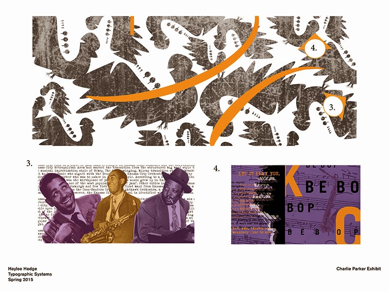
My two experiences of the exhibit and the print piece are meant to be seen in a way which music is seen, poetically not as realistic. Many of the images have different colors than the original black and white or have quotes or phrases that describe his life at the time. The first part of the exhibit shows early life and Kansas City and then through out it walks through his Be Bop phase in New York all the way until his death. At the end it's the total combination of all his experiences influencing his music in a way that is original to him. The no dancing sign is to indicate how Be Bop changed jazz from a dancing music to just sitting and listening music. I chose the words "chromatic" and "addiction" for the outside, because be bop was a huge part of his life and chromatic describes the way this music was unique. I used the word "addiction" to reflect how drugs had a big impact on his life, but even more so he was addicted to creating music. I used the same blue from the Charlie Parker head statue on the outside doors to make the connection that this ties into Charlie Parker without having it say it but still have the orange on the sides to tie the inside and outside together. I also wanted to honor the time, but not make the pieces feel like they came out of the 1930s, so I included old pictures and a typewriter typeface but kept the colors mellow. I would attribute this to calming, which also ties back to the Be Bop as a listening music and not a dancing music.


Subscribe to:
Posts (Atom)


