Sunday, November 29, 2015
Sunday, November 22, 2015
Wednesday, November 18, 2015
Typography in child interfaces
I stumbled upon this website and it was really helpful in the development of my moodboard. http://www.uxmatters.com/mt/archives/2011/06/effective-use-of-typography-in-applications-for-children-3.php
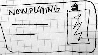
Interface wireframes - rough sketches
The interfaces above would be for the watch and physical object. The following interfaces are when connected to a car.
Wednesday, November 11, 2015
Monday, November 2, 2015
Final Questions
Compared to typical in-studio projects, how did the realistic nature
of this project (for the united way, viewed by the public, a budget,
etc) impact your work? (for example, were you more motivated to do good
work, or less? were budget and other constraints good or bad?)
I think the fact that we had a budget seemed very realistic and made it more like after college which I appreciated. I think the project had an awesome topic, and liked that we worked on a team. However, I thought maybe there were too many people doing just one direction. I think if you were to do this project again, I would consider dividing the class into groups of 5 or 6, delegating them each a role, and then each of those groups come up with a direction, sort of like a campaigns class. This way more work could be done outside of class.
How did the content impact you, compared to typical in-studio content? did erika’s involvement have any effect on your content understanding beyond your usual research process?
I liked the information that she provided how in our critique it was said that we didn't include all the content that they really wanted or thought was important. When doing the type book last year all of the copy was provided and then we were to design how ever we so choose. Maybe if Erika set out exactly the information she wanted before hand, we could do more designing and less writing and arguing about what to include. The topic made the designing process feel like we were doing something important for the community and I appreciate that.
Hard choices Final Design
We realized that it was important to keep it consistent that the reality be in red everytime, so with these small changes, we have our hard choices final piece!
Subscribe to:
Comments (Atom)


